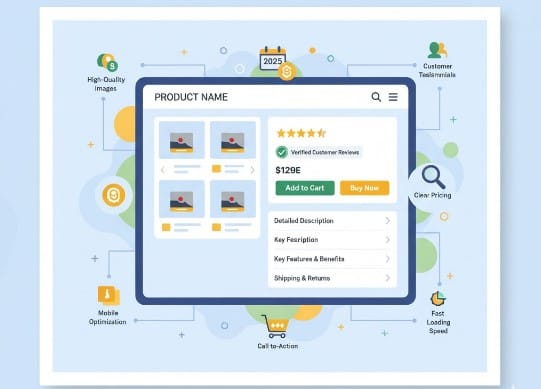
Introduction: Why Product Pages Make or Break Your Sales
Your product page is where curiosity turns into purchase decisions.
A visitor might land on your page from a social ad, organic search, or a newsletter, but if your product page isn’t clear, persuasive, and trustworthy, that potential sale vanishes in seconds.
In 2025, optimizing product pages for conversions isn’t just about pretty images — it’s about emotion, psychology, and clarity. Every word, picture, and button works together to build confidence and make buying irresistible.
In this guide, you’ll learn how to turn every product page into a high-converting sales machine, with examples and actionable steps you can implement immediately.
1. Craft a Compelling Product Title
The first thing your visitor sees is the title. It should be:
- Clear and descriptive
- Keyword-rich for SEO
- Specific enough to differentiate your product
Example:
Instead of:
“Leather Bag”
Try:
“Handcrafted Vegan Leather Tote – Sustainable & Spacious for Work & Travel”
This immediately communicates: quality, purpose, and features — all in one line.
Pro Tip: Include keywords your audience actually searches for, but keep it readable and natural.
2. Use High-Quality, Multi-Angle Product Images
Visuals are critical. Customers can’t touch your product, so images must do the selling.
Best Practices:
- Include 4–6 images (front, back, close-ups, lifestyle shots)
- Show products in real-life scenarios
- Offer zoom functionality
- Consider short videos or 360° spins
Example:
A sneaker brand noticed a 25% increase in conversion after adding a short video showing people running in their shoes.
Pro Tip: Include “scale” images — for clothing, show it on a model; for home goods, show size relative to everyday objects.
3. Write Persuasive Product Descriptions
Your description isn’t just about specs — it’s about benefits + emotions.
Structure:
- Feature first, benefit second: Tell customers what it does and why it matters
- Use bullet points for scannability
- Highlight unique selling points
Example:
Features: 100% organic cotton, machine washable, ethical sourcing
Benefits: Stay comfortable all day while supporting sustainable fashion
Pro Tip: Include storytelling snippets: “Inspired by coastal living, this beach tote fits your summer adventures perfectly.”
4. Showcase Social Proof
Reviews, testimonials, and UGC make visitors trust your brand.
Ways to Use Social Proof:
- Star ratings near the product title
- Customer reviews and photos
- “Most loved by X customers” badges
- Influencer testimonials or press mentions
Example:
A small skincare brand found that adding before-and-after photos from real customers increased add-to-cart clicks by 30%.
5. Optimize Your Call-to-Action (CTA)
Your CTA button is the final nudge — it must be visible, clear, and compelling.
Tips:
- Use action-oriented text: “Add to Cart,” “Get Yours Today,” “Start Your Free Trial”
- Make the button a contrasting color
- Place it above the fold and near key benefits
Pro Tip: Consider repeating the CTA at the bottom for long product pages.
6. Include Urgency and Scarcity
Limited-time offers or low-stock alerts can increase conversions without feeling pushy.
Example Phrases:
- “Only 5 left in stock!”
- “Sale ends in 12 hours”
- “Limited edition — don’t miss out”
Pro Tip: Combine scarcity with genuine benefits — don’t fabricate urgency, as it can erode trust.
7. Provide Clear Shipping & Return Information
Shipping and return details reduce friction and make customers feel secure.
- Show shipping cost upfront or offer free shipping thresholds
- Highlight return policy clearly: “30-day hassle-free returns”
- Include estimated delivery dates
Example:
Amazon’s consistent display of estimated delivery dates increases trust and encourages quicker purchases. Small stores can emulate this approach for customer confidence.
8. Optimize for Mobile Conversions
Over 70% of e-commerce traffic comes from mobile devices. Product pages must:
- Load quickly (<3 seconds)
- Have responsive layouts
- Ensure buttons are tappable and easy to click
- Avoid cluttered content
Pro Tip: Test your product pages on multiple devices — what looks great on desktop may feel cramped on mobile.
9. Leverage Product Variants and Personalization
If you offer sizes, colors, or bundles, make it easy to select and understand options.
- Dropdowns or swatches for colors
- Clear labels for sizes or quantities
- Highlight savings for bundles
Example:
A coffee brand lets users select grind type, roast, and subscription plan — all on a single, easy-to-use interface. This personalization increases conversion by 20%.
10. Use Analytics to Continuously Improve
A/B testing and analytics are critical for ongoing optimization. Track:
- Bounce rate and time on product page
- Scroll depth (are people reading the full description?)
- Add-to-cart and checkout conversion rates
- CTA click-through rates
Example:
A small fashion store tested two product descriptions — one focused on features, one on storytelling. The storytelling version increased sales by 18%.
Pro Tip: Small tweaks (headings, images, button color) can have a big impact over time.
Conclusion: Product Pages Are Your Digital Salesperson
Your product page is more than a listing — it’s the storyteller, educator, and persuader all in one.
By combining high-quality visuals, persuasive copy, social proof, and clear CTAs, you can transform browsers into buyers — even against big competitors.
🔑 Interactive Question: Which part of your product page could you improve today — images, copy, or social proof — to boost conversions immediately?
CTA: Start by auditing one product page today. Apply at least three of these strategies and track the impact — small changes can yield significant results.


