Introduction
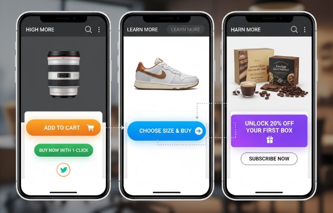
A well-crafted call-to-action (CTA) is one of the most critical elements of a product page. It guides visitors toward making a purchase, signing up, or taking another desired action.
Irresistible CTAs combine strategic wording, placement, design, and psychological triggers to boost conversions and improve the overall shopping experience.
1. Use Clear and Action-Oriented Wording
- Use strong, actionable verbs like “Buy Now,” “Get Yours,” “Claim Offer,” or “Shop Today.”
- Be specific about what happens when the user clicks the button.
- Avoid vague phrases like “Submit” or “Click Here” that lack urgency or clarity.
Tip: Make your CTA direct, concise, and easy to understand in a single glance.
2. Create a Sense of Urgency or Scarcity
- Highlight limited availability: “Only 5 left in stock”
- Emphasize time-sensitive offers: “Sale ends in 24 hours”
- Use exclusive language: “Join our VIP list” or “Get early access”
Urgency encourages visitors to act immediately rather than delay their decision.
3. Position CTAs Strategically on Product Pages
- Place CTAs above the fold so visitors see them without scrolling.
- Repeat CTAs after key product details or images for convenience.
- Use floating or sticky buttons on longer pages to keep CTAs visible at all times.
Tip: Strategic placement reduces friction and guides the user toward action naturally.
4. Design for Visibility and Contrast
- Use bold colors that stand out from the page background
- Ensure sufficient size for easy clicking on mobile and desktop
- Add white space around the CTA to make it pop
- Include hover effects or animations to draw attention
A visually appealing CTA catches the eye and encourages interaction.
5. Align CTAs with Customer Intent
- Match the CTA to the stage of the buyer journey:
- Browsing: “Learn More” or “See Details”
- Ready to purchase: “Add to Cart” or “Buy Now”
- Post-purchase: “Share with Friends” or “Leave a Review”
- Use personalization when possible: “Reorder Your Favorites” or “Complete Your Look”
Tip: Alignment with intent increases relevance and click-through rates.
6. Leverage Psychological Triggers
- Social proof: “Join 1,000+ satisfied customers”
- Reciprocity: Offer a free gift or discount with purchase
- Authority: “Recommended by experts” or “Top-rated product”
- FOMO (Fear of Missing Out): Limited stock or exclusive access
Psychologically compelling CTAs motivate visitors to take action instinctively.
7. Test and Optimize Continuously
- Conduct A/B testing on wording, color, size, placement, and design
- Monitor conversion rates and engagement metrics
- Iterate based on data-driven insights to improve performance over time
Tip: Continuous testing ensures your CTAs remain persuasive and effective in driving sales.
✅ Conclusion
Creating irresistible call-to-actions on product pages requires a balance of clarity, design, urgency, intent alignment, and psychological triggers. By carefully crafting CTAs, placing them strategically, and continuously testing and optimizing, e-commerce brands can maximize conversions, improve customer experience, and increase revenue.
A strong CTA doesn’t just ask visitors to act — it guides, motivates, and compels them to take the next step confidently.


